This notebook and all necessary files to create these plots can be found on my github: https://github.com/tonygallen
Plotting in Julia
There are an intimidating amount of plotting packages
Luckily, we have Plots.jl.
Plots.jl is a plotting metapackage which brings many different plotting packages under a single API, making it easy to swap between plotting "backends".
They all have their pros and cons. You can explore some here:
https://docs.juliaplots.org/latest/backends
Today, we will focus on PyPlot.
Pros:
- Tons of functionality
- 2D and 3D
- Mature library
- Well supported in Plots.jl
Cons:
- Uses python
- Dependencies frequently cause setup issues
- Inconsistent output depending on Matplotlib version
Installation
Unfortunately, you need not only Python but some of the SciPy ecosystem. You can simply install everything needed by installing Anaconda (https://conda.io/docs/user-guide/install/index.html).
To install the Plots package, in Julia simply type
using Pkg
Pkg.add("Plots")
And of course you will need some backend, so type
Pkg.add("PyPlot") # or Pkg.add("PlotlyJS"), for example

#some useful extensions you should add while your at it
#Pkg.add("StatPlots")
#Pkg.add("PlotRecipes")
## Now we are ready to get started!
using Plots
## Lets jump right in
data = rand(10)
f = plot(data)
@show f
We didn't specify a backend! Mine defaulted to GR. Let's tell it to use pyplot.
Plots.pyplot()
f = plot(data);
@show f

You can add more than 1 graph to the same plot:
# In Plots.jl, every column is a 'series'
data2 = rand(10, 2); # 10x2 random mat
plot(data2)

# not necessary to use a variable f = ...

# You can also add to the most recent plot using plot!()
plot!(rand(10))

# or add to a specific plot
plot!(f,rand(10))

Attributes
aka how to make your graph pretty
Julia calls things like color, line width, etc. 'Attributes'.
In general, these are set by keyword arguements.
i.e. plot(data, keyword=value)
For a long list of Attributes, check out: http://docs.juliaplots.org/latest/attributes/
And check http://docs.juliaplots.org/latest/supported/ to see if your backend supports those Attributes
Lets Play around with some Attributes
First: linestyle, color, and markershape
# tip: use Plots.supported_styles() or Plots.supported_markers() to see which linestyles or markershapes you can use
@show Plots.supported_styles();
@show Plots.supported_markers();
plot(data2, markershape = :ltriangle, linestyle = :dashdot, color = [:black :orange])

This is a prime example of matplotlib dependencies raising errors
# You can use ! to update the last plot with certain Attributes

plot!(title="Test Plot")

# Certain attributes have their own modifier function (!) too

plot!(ylabel = "y axis")
xlabel!("x axis")

#same result

There are also these 'magic' attributes (e.g. axis, xaxis, marker, line) where you can pass multiple sub-attributes at once.
You don't even have to label your sub-attributes. Julia does some type-checking magic to figure out which value applies to which argument.
Lets test this out
# lets use new data

data3 = hcat(Array(0:0.01:1),Array(1:-0.01:0)) #concatenate along dimension 2
data3 += .05*randn(size(data3)) # lets add randomness so its not so boring
plot(data3, title="Pizza Intake vs Regret", xaxis = (font(5), "Slices Eaten", 0:25:101, :log10),
     ylabel="Regret",line=(0.5, 3), label=["Charlie" "Omar"])

## Each attribute in xaxis = (font(32), "Slices Eaten", 0:25:101, :log10) has its own name.
## We could've assigned their values seperately, e.g.
## xtickfont = font(32), xlabel = "Slices Eaten", ...

## same with line=(0.5, 3)

To make all of these changes by hand (clicking your mouse), use gui()
doesn't work on Jupyter
gui()
Input arguments take many forms
Choose your favorite:
plot()                                    # empty Plot object
plot(4)                                   # initialize with 4 empty series
plot(rand(10))                            # 1 series... x = 1:10    <--------------------- we've used this
plot(rand(10,5))                          # 5 series... x = 1:10    <--------------------- and this
plot(rand(10), rand(10))                  # 1 series
plot(rand(10,5), rand(10))                # 5 series... y is the same for all
plot(sin, rand(10))                       # y = sin(x)
plot(rand(10), sin)                       # same... y = sin(x)
plot([sin,cos], 0:0.1:π)                  # 2 series, sin(x) and cos(x)
plot([sin,cos], 0, π)                     # sin and cos on the range [0, π]
# you can pass in generic functions like:
sin
Does order of inputs matter?
Well, sometimes
p1 = plot(sin, 0:0.01:2*pi)
p2 = plot(0:0.01:2*pi, sin)

x = Array(0:0.01:2*pi);
y = sin.(x); # elementwise sin(x)

p3 = plot(x,y)
p4 = plot(y,x)


plot(p1,p2,p3,p4)

# layout is:
# p1 p2
# p3 p4

Layout
The above plot defaulted to a 2x2 grid.
We can change this using the argument: layout = (4,1)
You can also add attributes as you did previously
using LaTeXStrings

plot(p1,p2,p3,p4, layout = (4,1),
     legend=[false true false true],
     label = ["" "sin(x)" "" "arcsin(x)"], # using "" skips over that plot.
     annotate = [(3,0,"sin(x)") (0,0,"") (3,0,text(L"sin(x)")) (0,0,"")]) # L"" uses LaTeX to construct string

#Note: changing the attributes like this changes the original plots!
p1

Images
(a reason to show off my dogs)
using Images #may need to Pkg.add("Images")
img1 = load("dog.jpg");
img2 = load("dog2.jpg");
img3 = load("dog3.png");
plot(img1) # Anna

plot(img2, aspect_ratio=.8) # Gracie

plot(img3) # Charlie

Histograms
data4 = randn(1000) #normally distributed
data5=2*ones(1000)+randn(1000)
histogram(data4, nbins=20, color=:red, fillalpha=.3)
histogram!(data5, nbins=20, color=:blue, fillalpha=.3,legend=false)

2D Histrograms
Plots.pyplot() # back to pyplot
histogram2d(randn(10000), randn(10000), nbins=50)

Scatter Plots
x = Array(0:0.01:9.99)
y = exp.(ones(1000)+x) + 4000*randn(1000)
scatter(x,y,markersize=3,alpha=.8,legend=false)

# lets fit a degree 5 polynomial
A = [ones(1000) x x.^2 x.^3 x.^4 x.^5]
c = A\y
f = c[1]*ones(1000) + c[2]*x + c[3]*x.^2 + c[4]*x.^3 + c[5]*x.^4 + c[6]*x.^5
plot!(x,f,linewidth=3, color=:red)

Polar Coordinates
theta = 0:2*pi/100:2*pi+2*pi/100
r=-(cos.(theta).+1)

plot(theta,r, proj=:polar) # <3

Pie Charts
Plots.gr() # I prefer the default GR backend look for pie charts
x = ["Nerds", "Hackers", "Scientists"]
y = [0.4, 0.35, 0.25]
pie(x, y, title="The Julia Community", l=0.5)

#taken from http://docs.juliaplots.org/latest/examples/pyplot/
Contours
Plots.pyplot() # back to pyplot
x = 1:0.5:20
y = 1:0.5:10
g(x, y) = begin
        (3x + y ^ 2) * abs(sin(x) + cos(y))
    end
X = repeat(reshape(x, 1, :), length(y), 1)
Y = repeat(y, 1, length(x))
Z = map(g, X, Y)
p1 = contour(x, y, g, fill=true)
p2 = contour(x, y, Z)
plot(p1, p2)

# taken from http://docs.juliaplots.org/latest/examples/pyplot/

Heat maps
# from Yale's face database http://www.cad.zju.edu.cn/home/dengcai/Data/FaceData.html

using DelimitedFiles
A = readdlm("Yale_64.csv",',')
B = reshape(A'[:,49], 64,64)


heatmap(B[end:-1:1,end:-1:1])

Plot3D
t=0:pi/200:7*pi
x=cos.(t)
y=sin.(t)

plot3d(x,y,t,lw=2,leg=false)

Surface
x=-1:0.01:1
y=-1:0.01:1
h(x,y)=x^2-y^2;

surface(x,y,h)

Wireframe
Plots.gr() # wireframe not working with pyplot atm (https://github.com/JuliaPlots/Plots.jl/issues/1830)

x=-1:0.1:1
y=-1:0.1:1
h(x,y)=x^2-y^2;

wireframe(x,y,h)
And more!
seriestypes = [:step, :sticks, :bar, :hline, :vline, :path]
titles =["step" "sticks" "bar" "hline" "vline" "path"]
plot(rand(20,1), st = seriestypes, layout = (2,3),ticks=nothing, legend=false, title=titles,m=3,c=[1])

# and I'm sure that is not all of them
Let's have some fun!
Animations
Making animations with Plots.jl is made simple by the @gif and @animate macros.
The main difference is @animate returns an 'Animation' object for later processing, while @gif creates the animation immediately for viewing.
(note: I had some troubles getting @gif and gif() to work. You may need to install ffmpeg (https://ffmpeg.zeranoe.com/builds/) and add it to your PATH. Theres a lot of Issues on the Plots.jl github helped me get it working!)
How to use:
## @gif or @animate macro should be followed by some sort of iteration

anim = @animate for i=1:100 # this will create 100 frames
    plot(...) # each frame is given by the plot
end

# each frame has been (temporarily) saved

# to create a gif:
gif(anim, fps = 15) # setting fps is optional
# some more options
anim= @animate for i=1:100
    plot(...)
end every 10 # will save every 10th iteration

gif(anim)
@gif for i=1:100
    plot(...)
end when i > 50 && mod1(i, 10) == 5
Example(s)
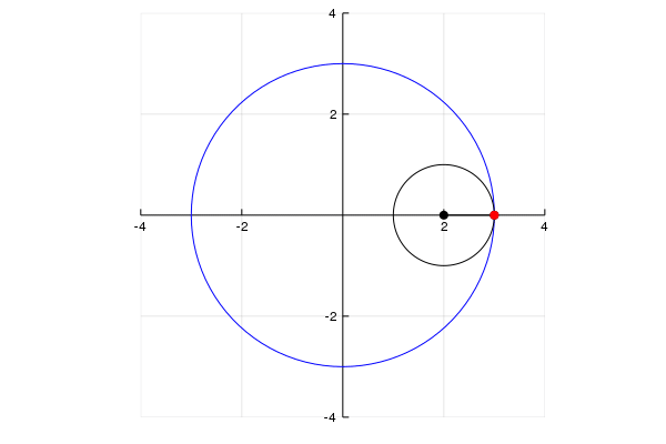
## Hypocycloid

## Lets recreate the gif on the Wiki (https://en.wikipedia.org/wiki/Hypocycloid)

r = 1
k = 3
n = 100

th = Array(0:2*pi/100:2*pi+2*pi/100) # theta from 0 to 2pi ( + a little extra)
X = r*k*cos.(th)
Y = r*k*sin.(th)


anim = @animate for i in 1:n

    # initialize plot with 4 series
    plt=plot(5,xlim=(-4,4),ylim=(-4,4), c=:red, aspect_ratio=1,legend=false, framestyle=:origin)

    # big circle
    plot!(plt, X,Y, c=:blue, legend=false)

    t = th[1:i]

    # the hypocycloid
    x = r*(k-1)*cos.(t) + r*cos.((k-1)*t)
    y = r*(k-1)*sin.(t) - r*sin.((k-1)*t)
    plot!(x,y, c=:red)

    # the small circle
    xc = r*(k-1)*cos(t[end]) .+ r*cos.(th)
    yc = r*(k-1)*sin(t[end]) .+ r*sin.(th)
    plot!(xc,yc,c=:black)

    # line segment
    xl = transpose([r*(k-1)*cos(t[end]) x[end]])
    yl = transpose([r*(k-1)*sin(t[end]) y[end]])
    plot!(xl,yl,markershape=:circle,markersize=4,c=:black)
    scatter!([x[end]],[y[end]],c=:red, markerstrokecolor=:red)


end
gif(anim)
Resources
Plots.jl Documentation (http://docs.juliaplots.org/latest/)
PyPlot Github (https://github.com/JuliaPy/PyPlot.jl)
Lecture on Plotting in Julia (https://lectures.quantecon.org/jl/julia_plots.html)
Huda's Plotting Tutorial (https://github.com/nassarhuda/JuliaTutorials/blob/master/plotting.ipynb)