Interactive Plotting with GeoGebra and Inkscape
Video
Motivation
Graphing in this plot-look-modify-plot loop is OK, but it can be both unintuitive and hard to control specific details.
Today we will be talking about two tools that are excellent for creating intricate graphics with very fine control, embedded $\LaTeX$, and scalable output.
GeoGebra
First, let's discuss GeoGebra. Many of the things we will say also apply to the for-profit clone Desmos, but there is little reason to support corporate power-grabs no matter how many non-binding assurances they make on their website of their good intent.
GeoGebra is a wide variety of integrated technologies in one package - a Computer Algebra System, 2D and 3D Graphing Calculator, 2D and 3D Constructive Geometry Solver, Spreadsheet system, and more. While not quite optimized for mathematical research, it can be a great graphing tool, interactive teaching and assessment tool, mathematical aid, or just a fun toy.
GeoGebra is undergoing a fair bit of unbundling, but I am still fond of the Classic Interface. The tools remain virtually identical, just reshuffled a bit, so you can follow along on whatever GeoGebra platform - download or web - you wish.
2D Plots
The default GeoGebra view, which you will get to by clicking "Start Calculator" or by launching a downloaded GeoGebra Classic, is set up around plotting.
In the top left, there is an input bar. Click it and type a function, like $x(x-1)(x-2)$.
GeoGebra is actually a highly featured Computer Algebra System - and has its own language which can be used to construct, and compute on, objects.
Fortunately, when graphing or exploring, none of that is necessary - we can construct our functions with the input bar and the simple tools in the toolbars.
Styling & Settings
Most objects - including the canvas itself - can be customized from the settings menu, accessible from the gear in the upper left corner. Whatever object is selected, can be customized.
Play around with these options - they offer a wide variety of customization.
Basic
The Basic menu sets up a few main properties of note:
- The name (which is mainly used for referring to it in other object construction)
- The definition, in case we want to change how it is defined
- The caption, which we can display next to the function in the view
- The Show options, which can hide an object or its label from view
The caption is notable that - like a Text object - it can contain (a subset of) $\LaTeX$, so we can label our graphs with familiar notation.
In GeoGebra, you will often be building objects out of other objects in a constructive way, so being able to hide this "construction geometry" is remarkably helpful.
Other Tabs
Color and Style are fairly self-explanatory, but it is worth noticing the Advanced and Scripting tabs.
We won't be using them today, but they allow for the construction of complicated interactable figures with conditionals and computations - which you can share on the internet, or as .ggb files.
The scripting language is based heavily on JavaScript, a language we have danced around but never talked about in depth. Today will very much continue that trend.
Interactivity
If you just type in a variable name, it will create a Slider. Editing a slider will give you options about the variable - its minimum, maximum, and step values - which allow for basic user input.
You can also use draggable points on the display for user input - as we will see getting into the Geometry part of GeoGebra.
Graphs and Geometry
Open the geometry toolbars, and you will see a variety of options.
Points
The basic is the point - which can be placed anywhere, or constrained to an existing curve, surface, or intersection. They can also be placed explicitly.
Very useful for constructing objects - either in the algebra view or with other tools - they are the fundamental building blocks of geometry in Geogebra.
Lines
The second construction you will learn about in any constructive geometry course are Lines, and GeoGebra mirrors that.
With two points, you can place Lines, Segments, or Rays - along with some styled versions.
The next dialog section contains Constructive Geometry rules for creating lines.
Circles and Ellipses
The next two important toolbars are Circles - which can be constructed point-radius, center-edge, or three-point (as well as arc versions).
With this, our compass-and-straightedge constructions are more than complete, and most geometry we will need for education is at our fingertips without using a single line of code.
Ellipses can be determined through either 3 points with special meaning (two foci and a point on the edge), or through 5 points in general position.
Other Types
There are some other useful constructions in this menu, though we have enough to do all our compass and straightedge constructions and more.
A particularly useful one for geometry drawings or demonstrations is the angle, which creates a variable you can control for the angle between two lines.
Spreadsheets and Point-Line Plots
OK, we can plot explicitly defined functions and draw geometry.
How could we use this to plot data, or functions outside of its algebra?
The answer will probably not surprise you - it can do Polyline plots, like MatPlotLib and MATLAB before it.
However, it - by nature of its algebra and vector graphics - can't handle as many lines.
The Spreadsheet View
In the top left menu, open the "Views" and "Spreadsheet" (this is easiest in the Classic version.)
This simple spreadsheet will allow you to create tables of values, and plot those as either histograms or, more likely, collections of points/lines.
The easiest way to get data in is to copy-paste it from another spreadsheet or csv. While most OS copy-paste buffers are not large enough for huge amounts of data, neither is GeoGebra able to handle them, so this is not in the end that much of a limitation.
For example, you could copy-paste:
-3,9
-2,4
-1,1
0,0
1,1
2,4
3,9
To create a rough approximation of the squares.
From here, you can use the tools at the top of the spreadsheet dialog - or select and right-click the columns - to create objects out of them, such as points or matrices.
These objects will be linked to the spreadsheet - modifying the spreadsheet will modify the values, and modifying the objects will modify the spreadsheet.
3D
In the Views, you can also notice the 3D view (and a spare graphics view).
Most things work exactly the same in 3D, but you will notice that some of your geometry tools are updated. Manipulating points by hand is a bit harder, but you can do it numerically.
In addition, you can plot 3d functions just like 2d functions - in terms of the variables $x$, $y$, and $z$.
For example, writing:
z^2=x^2+y^2 will plot you a simple cone.
With tools for creating solids of rotation, and for all the commonly discussed 3d tasks in a calculus course and more, this is a great option for making complicated 3d plots and interactive demonstrations.
Exports
To share our creations, we will need some way to store them as files. That is where Exporting comes in.
Open up the "file" menu - in the top right of the classic interface, or top left of the new one - and click "Download As" to see a list of the available export formats.
There are three of note, of wildly different types.
GGB
.ggb is a zip file that allows you - or anyone you share the file with - to interact with your creations, as they were at time of export.
This file can be opened in the downloadable GeoGebra, uploaded to the webapp, or even placed on a webserver and loaded in a GeoGebra applet on a website you control (such as your personal math dept page, or course pages!)
PNG
Raster images are a classic kind of image - containing pixel by pixel color and transparency data, which can be displayed on screen (often with some scaling).
Portable Network Graphics are one of the dominant Raster formats, and with many good reasons. Designed with natural optimizations and a hierarchical nature allowing for quick rendering followed by greater detail as the image loads, they are a great option for embedding in your websites, presentations, or $\LaTeX$ documents.
SVG
Scalable Vector Graphics - SVG for short - is a specification for images made of geometry, rather than pixels. It can be a great export format for sharing, but the output from Inkscape is often a bit off from what you want - it can be hard to accurately position text, to crop, or to do little tweaks.
Fortunately, SVG is a very editable format - and you can open them with the next piece of software on our list, Inkscape.
Inkscape
Inkscape is a remarkable piece of technology, and the leading Vector Graphics Editor
Simple SVG Editing
Once you have launched Inkscape, play around a bit with the rectangle, ellipse, and line tools (by default, on the left.)
Notice how you are not creating pixels but objects - that can be edited and transformed, stretched and moved, and styled with the Fill and Style menu (right click on a thing to style, or ctrl-shift-f).
You can set a lot of useful global properties from the File->Document Properties dialog (ctrl-shift-D), such as page dimensions and a snapping grid.
Text
Text in SVGs can be rather finnicky, and as such, you are allowed a lot of fine control.
Text settings - available in the top when the text tool is selected - apply on a per-character basis. They include not just size but kerning - precise spacing control between letters.
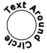
You can also find various other exciting text tricks, such as the Put on Path tool in the Text menu:
$\LaTeX$
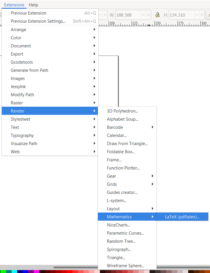
Inkscape can connect to your $\LaTeX$ install to create SVG-renderings of $\LaTeX$ formulae. The behind-the-scenes is a bit complicated, but - with a proper $\LaTeX$ install - there will be a dialog Extensions->Render->Mathematics:
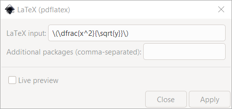
Once open, you can enter in some $\LaTeX$:
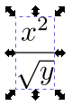
And it will create a SVG object representing the expression:
Graphs
Now we've reached one of the technologies I would recommend for that other kind of graphs - nodes and edges. For quick graphs, nothing beats pgf-tikz in $\LaTeX$, and for precise graphs little beats networkx; however, both technologies are a bit complicated for newcomers.
Inkscape makes basic graphs and diagrams fairly easy:
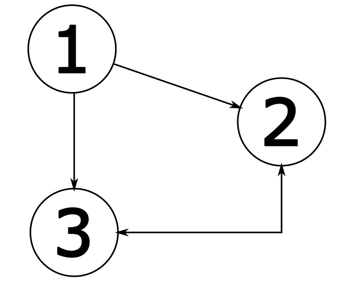
Nodes
Create a circle with the ellipse tool, holding ctrl to fix an aspect ratio.
Create a piece of text - a number, for example - and mess around with the font, size, and scale until you like it.
Snapping and Grouping
Turn on snapping in the interface (by default, the right side of the screen). Turn on snap to bounding boxes, and within that section, snap to center.
Now you can drag your text to your circle, and it'll magically align itself right in the middle!

Select both and press ctrl-g to group them together. Now they move as one object. You can edit them by ungrouping them - ctrl-shift-g - or by double-clicking them to "enter" the group.
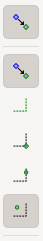
Diagram Connector Tool
One of Inkscape's advanced features is the Diagram Connector Tool on the tools panel (by default, the left):

Which lets you drag between the centers of objects or groups to connect them with dynamic lines.
In the fill-and-style dialog, you can change their arrow behavior, thickness, color - a wide variety of effects.
You can also use the auto-layout and auto-routing features of the tool.
Advanced Editor
Open the advanced editor with ctrl-shift-x, and click around on the document.
This may remind you of the HTML inspector - in fact, it is a very similar concept. SVG documents are also an XML specification, just like HTML - and can be embedded into HTML as tags, manipulated in the browser.
Inkscape allows you to work in both the raw XML and in the interactive editor, giving you both the ease of free-handing shapes/sizes, the What-You-See-Is-What-You-Get style editing, and the power that comes from numerical control when you need it.
Try playing around with some values in the XML editor, and seeing the results play out on screen.
SVG Namespace
With a growing understanding of XML and SVG, and your Python string formatting skills, you can actually build very effective SVGs from scratch, with lots of features - including some that Inkscape can't use, like SVG Animations.
And now we have finally reached the technology I would recommend to the most precision-obsessed. If you want to control every aspect of your graph, you can programmatically draw it as an SVG - every tick, every line or spline - just how you like it. It may take you hours longer than a quick matplotlib or GeoGebra call, but that is a tradeoff you may be willing to make.
You can find the specification on the W3C website, or some easier-to-read but less complete documentation over at W3Schools.
Exports
Inkscape SVGs are valid image files in their own right, and can be used on the web. However, you may find yourself wanting other image formats for a variety of reasons - and if you are planning on using an SVG for display, you may want to export as well.
There are many exports, but there are three I want to talk about today.
Encapsulated PostScript (.eps)
This format was designed specifically for inclusion in $\LaTeX$, and will offer you the best compatibility with $\LaTeX$'s \includegraphics command. This also provides excellent compatibility for embedded $\LaTeX$ text in your SVG, from GeoGebra or Inkscape.
PNG
As we discussed earlier, PNGs are in many ways the gold standard for raster graphics shared over networks. There is a special export dialog for them in the file menu, and in general will be your go-to option for rasterized graphics.
Web-Optimized SVG
SVGs offer numerous advantages over other formats, especially for simple, repeated, or highly geometric figures. They are also great for designing dynamic UIs that scale to the screen.
However, Inkscape keeps a lot of semantic information (such as groups) and a lot of extraneous information.
The optimized SVG save option can - for simple files - give you absurdly small image sizes, perfect for websites.
Assignment
The Story So Far
Suppose you are arguing on the internet, on some math-hobbyist forum. Someone has asked how to find the "center" of an ellipse, and the accepted answer is to drop perpendiculars from two points, and find their point of intersection. They have demonstrated with the only ellipse they know:
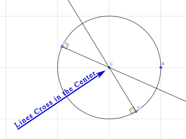
Communicating with words isn't working. You need to speak a language they can understand - that of pictures.
Using Geogebra, create an image:
- With a fixed, square grid as in the example image.
- With an ellipse other than a sphere.
- With a point at the "center" of the ellipse (centroid, to be precise) $C$.
- With two points P1 and P2 on the Ellipse.
- With two perpendicular lines, which clearly do not meet in the center.
Remember that you can use construction geometry that you then hide.
Export your drawing as an SVG, and open it in Inkscape.
Using Inkscape:
- Set your figure size to a reasonable value - 3 inches wide, and however tall.
- Add a pair of arrows, with text, pointing out the different center and intersection (or lack of intersection).
- Export your image to PNG, cropped to your figure size.
Graded Assignment: Upload the resulting PNG to Brightspace.
As a bonus, it can be fun to show that - in general - infinitely many ellipses can be tangent along two different lines at two different points. This may be easier in a more robust geometry solver, such as Autodesk Fusion, but is doable in GeoGebra.