More MatPlotLib
Video
Motivation
So you can plot lines, and you can plot them next to each other - on the same graph axes or on different adjacent graphs.
MatPlotLib can plot so many more lines than you can even imagine.
Statistical Plots
Accurately communicating statistical data is a study that I would self-rate myself a novice at. A lifelong pursuit for some, one method of universal agreement is that selecting the right plot for the data - from a large collection of potential plots - is essential.
A great resource on that front is the matplotlib examples gallery.
We're going to shy away from real data for now, so our setup is going to be:
from matplotlib import pyplot
import numpy
pyplot.style.use("ggplot")

gen = numpy.random.default_rng()
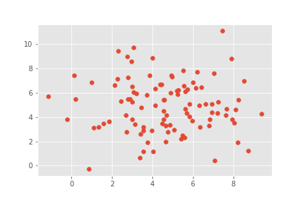
Scatter Plots
Basic scatter plots - in matplotlib - are line plots without the lines:
x_values = gen.normal(5,2,100)
y_values = gen.normal(5,2,100)

figure, axes = pyplot.subplots()

axes.scatter(x_values,y_values)
figure.savefig("scatter_example.png")
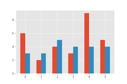
Bar Graphs
Bar graphs in matplotlib are just scatter plots of rectangles that reach toward an axis (by default, the x-axis):
a_set = gen.integers(2,11,6)
b_set = gen.integers(3,7,6)

figure, axes = pyplot.subplots()

axes.bar(numpy.linspace(0-.15,5-.15,6),a_set,.3)
axes.bar(numpy.linspace(0+.15,5+.15,6),b_set,.3)
figure.savefig("bar_example.png")
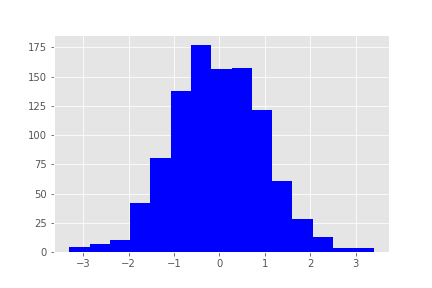
Histograms
This is the first plot where matplotlib can pick up some of the heavy lifting.
Often, statisticians bucket things into categories.
numpy.histogram will happily bucket the data for you if you want data buckets - and you can define the buckets! That data could then be histogrammed.
For simple graphing, however, MatPlotLib can do that for you:
data = gen.normal(0,1,1000)

figure,axes = pyplot.subplots()
axes.hist(data,15,color="blue")

figure.savefig("histogram_example.png")
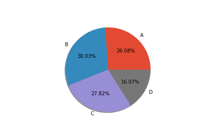
Pie Charts
figure, axes = pyplot.subplots()

sizes = gen.integers(100,300,4)
labels = ["A","B","C","D"]

axes.pie(sizes,labels=labels,autopct="%.2f%%",shadow=True)
figure.savefig("pie_example.png")
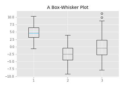
Box-Whisker Plots
While often bemoaned, box-whisker graphs can produce quick insights to the trained statistical eye (for roughly normally-distributed data):
data1 = gen.normal(5,2,100)
data2 = gen.normal(-2,3,100)
data3 = gen.normal(0,4,100)

figure, axes = pyplot.subplots()
axes.set_title("A Box-Whisker Plot")
axes.boxplot([data1,data2,data3])
figure.savefig("box_plot_example.png")
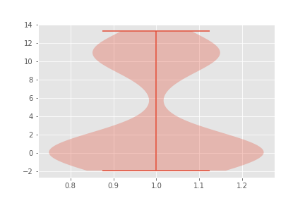
Violin Plots
For less normal data (but still normal..ish), a violin plot is great:
violin_data = numpy.concatenate([gen.normal(0,1,100),gen.normal(11,1,60)])

figure, axes = pyplot.subplots()

axes.violinplot(violin_data)
figure.savefig("violin_example.png")
Fitting Curves
However, it is too much to ask for numpy to fit our curves for us, in general.
It will happily plot them for us, though!
Let's construct a dataset with a pretty good curve fit, and use scipy:
x_true = numpy.linspace(-1,3,100)
y_true = x_values *(x_values - 1)*(x_values-2)

x_fudge = gen.normal(0,.2,100)
y_fudge = gen.normal(0,.2,100)

x_values = x_true + x_fudge
y_values = y_true + y_fudge

figure, axes = pyplot.subplots()

axes.scatter(x_values, y_values)
poly = numpy.polyfit(x_values,y_values,3)

poly_x = numpy.linspace(-1,3,100)
poly_y = sum(coeff*poly_x**i for i,coeff in enumerate(reversed(poly)))

axes.plot(poly_x,poly_y,color="blue")
figure.savefig("polyfit_example.png")
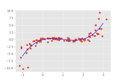
Curve fitting is an art of its own.
Higher Dimensional Data
So far we've only discussed 2-dimensional data. While N-dimensional data can be completely represented as 2d views from different angles, we have other tools.
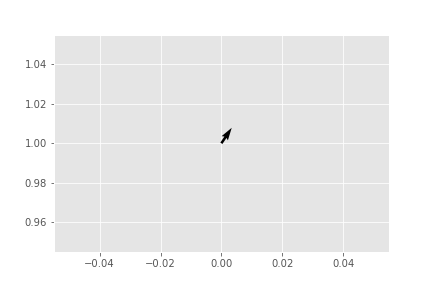
Quiver Plots
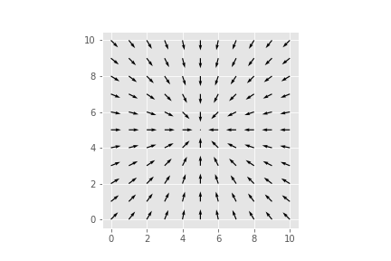
For plotting fairly continuous 4d data sampled on a discrete grid, such as vector fields, quiver plots are a fun and easy method; we can specify with 4d coordinates:
figure, axes = pyplot.subplots()
axes.quiver([0],[1],[2],[3])
figure.savefig("quiver_example_1.png")
Note that, by default, quiver automatically scales the plots. We can overrride that:
figure, axes = pyplot.subplots()
axes.quiver([1],[1],[1],[1],units="xy",scale=1)
axes.set_xlim(0,3)
axes.set_ylim(0,3)
axes.set_aspect(1)
figure.savefig("quiver_example_2.png")
However, you can see that this can get messy for general grids of 4d data.
For simple vector fields, it is great - and can accept the coordinates in one or two dimensions.
It can even automatically construct integer lattices for the x,y coordinates (if unspecified):
figure, axes = pyplot.subplots()
a = numpy.linspace(-5,5,11)
x_vals,y_vals = numpy.meshgrid(a,a)
dist = numpy.sqrt(x_vals**2+y_vals**2)+.01
x_arrow = -x_vals/dist
y_arrow = -y_vals/dist
axes.quiver(x_arrow,y_arrow)
axes.set_aspect(1)
figure.savefig("quiver_example_3.png")
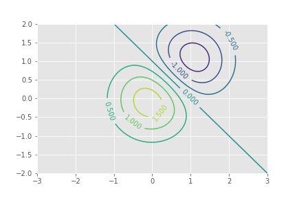
Contour Plots
A tangential way to represent 3D data is the contour plot. Popular for topographic maps, they can help you quickly identify level sets - which comes up a surprising amount in optimization problems.
There are some configurable automatic defaults, but it constructs the level set approximations for you (I am fond of this gallery example, adapted):
x = numpy.linspace(-3, 3, 100)
y = numpy.linspace(-2, 2, 100)
X, Y = numpy.meshgrid(x, y)
Z1 = numpy.exp(-X**2 - Y**2)
Z2 = numpy.exp(-(X - 1)**2 - (Y - 1)**2)
Z = (Z1 - Z2) * 2

figure, axes = pyplot.subplots()
CS = axes.contour(X, Y, Z)
axes.clabel(CS, inline=1, fontsize=10)
figure.savefig("contour_example.png")
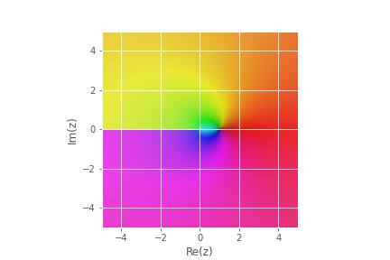
Color Complex Maps
One situationally excellent way to plot 4 dimensional data is Hue-Saturation color maps.
This is actually fairly easy to do by hand - you can build images from explicit hue-saturation values, with some interpolation if your samples aren't close enough, and matplotlib doesn't want to do it for us - but the Multi-Precision Math library has some builtins for it.
this is particularly apt for plotting complex polar data, because of the natural periodic behavior of one axis, and exponential of the other - matching human perception of hue and saturation.
import mpmath
plot = mpmath.cplot(mpmath.ln, file="mpmath_example.png", points=1000)
Weighted Scatter Plots
Using color as an axis isn't just for complex numbers - we can take our 2d scatter plots and add a color axis:
x_data = gen.uniform(0,1,100)
y_data = gen.uniform(0,1,100)
u_data = gen.uniform(0,1,100)

figure, axes = pyplot.subplots()

axes.scatter(x_data,y_data,c=u_data,cmap=pyplot.get_cmap("bwr"))
figure.savefig("color_example.png")
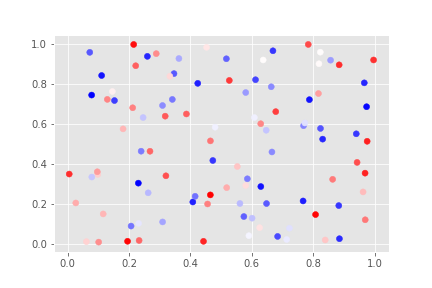
This uses another concept imported from matlab - "colormaps" and "norms".
Default colormaps are available at the official documentation, and there are a lot of them. Choose them based on your data type - periodic data suits a periodic colormap.
These maps can be manipulated with the tools in matplotlib.colors, but there are so many builtins that you will rarely need to.
norms are a further tool, from matlab, for converting your c-data to the target range. There is a full documentation on normalizations,
Size
v_data = gen.integers(1,10,100)
figure, axes = pyplot.subplots()
axes.scatter(x_data,y_data,c=u_data,cmap=pyplot.get_cmap("bwr"),
             s=v_data**2)
figure.savefig("color_example_2.png")
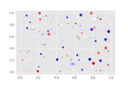
The size is a size in pixel area - so you can see to get a linear size variation, you can square your data.
3D Plots
So far, we have been forcing our data down to fewer axes - and losing some representation in the process.
Most of the things today would be relatively simple to put together by hand.
However, MatPlotLib is capable of something more complicated - 3 spatial axes, projected to a slanted 3d view.
To do that, we will need to pass through a subplot keyword parameter:
figure,axes = pyplot.subplots(subplot_kw={"projection":"3d"})
Now we've got a 3d axis! But what can we do with it?
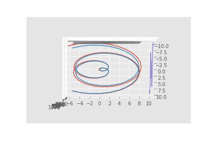
Scatter and Lines
Scatter and Line plots work basically the same:
t_vals = numpy.linspace(-10,10,100)
x_vals = t_vals*numpy.cos(t_vals)
y_vals = t_vals*numpy.sin(t_vals)
z_vals = t_vals**3

figure,axes = pyplot.subplots(subplot_kw={"projection":"3d"})
axes.scatter(x_vals,y_vals,z_vals)
figure.savefig("3d_example_1.png")
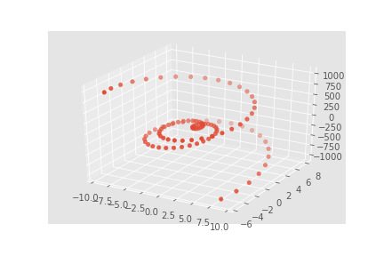
Except that they already use color/size to help show depth, so we shouldn't override it too much.
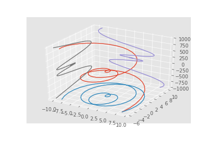
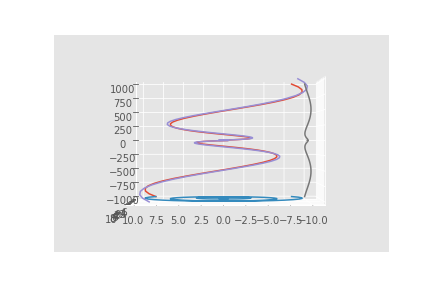
You can even place 2d plots in the figure:
figure,axes = pyplot.subplots(subplot_kw={"projection":"3d"})
axes.plot(x_vals,y_vals,z_vals)
axes.plot(x_vals,y_vals,zdir="z",zs=-1000)
axes.plot(x_vals,z_vals,zdir="y",zs=10)
axes.plot(y_vals,z_vals,zdir="x",zs=-10)
figure.savefig("3d_example_2.png")
Manipulating 3d Plots
We can change our viewing angles on a 3d plot, in degrees (because matlab do be like that):
axes.view_init(elev=0,azim=90)
figure.savefig("side_view_example.png")
axes.view_init(elev=90,azim=0)
figure.savefig("above_view_example.png")
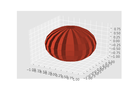
Surface
Surfaces are square meshes, and as such, need square data. We don't, however, need to constrain ourselves to a cartesian grid:
resolution = 20
latitude = numpy.linspace(0,2*numpy.pi, resolution)
longitude = numpy.linspace(-numpy.pi,numpy.pi,resolution)
x_values = numpy.outer(numpy.sin(latitude),numpy.sin(longitude))
y_values = numpy.outer(numpy.cos(latitude),numpy.sin(longitude))
z_values = numpy.outer(numpy.ones(resolution),numpy.cos(longitude))

figure,axes = pyplot.subplots(subplot_kw={"projection":"3d"})

axes.plot_surface(x_values,y_values,z_values)
figure.savefig("rough_surface_example.png")
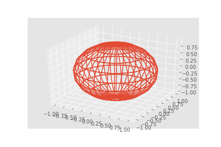
Wireframe
We can also make it a wireframe:
figure,axes = pyplot.subplots(subplot_kw={"projection":"3d"})

axes.plot_wireframe(x_values,y_values,z_values)
figure.savefig("rough_wireframe_example.png")
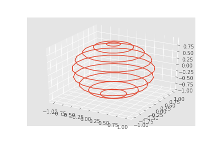
We can get sparser samples, and lines in just one direction, with:
figure,axes = pyplot.subplots(subplot_kw={"projection":"3d"})

axes.plot_wireframe(x_values,y_values,z_values,rstride=0,cstride=2)
figure.savefig("latitude_example.png")
Assignment
Today's assignment is to go through the examples - here or on the official website - and select a plot type you don't know.
Find an appropriate, real-world dataset - two great sources are wikipedia tables (which can be turned into CSV with a number of tools - I'm fond of this simple one) and government websites - and plot it in a new-to-you, informative way. You could consider plotting data relevant to your work, research, or hobby - there is a lot of pokémon data to be mined out there!
Submit the
.pngoutput to Brightspace, with appropriate titles and labeling.