MatPlotLib
Video
Motivation
Say you have a bunch of data, and you want to visualize it or communicate it.
At this point you probably know enough to put together an image - pixel by pixel - that can draw an example function, or some example data.
Fortunately, you don't have to do that: others have done it for you, in a relatively simple but a bit arcane package known as matplotlib.
Inspired by MATLAB's confusing and somewhat nonsensical plotting functionality, there are countless ways the software can be invoked.
What follows is not the most common way, but is a fairly modern and relatively reliable way.
Canvases, Figures, and Axes
MatPlotLib draws what it draws on a canvas, which is a fancy word for a grid of pixels. You will likely never need to access the canvas directly.
Figures
Each canvas, by default, is tied to one figure. A figure is a container for all the objects you want to draw - your axes, legend, labels, ticks, grid, and of course your data.
To create a new blank figure, call the command pyplot.subplots:
from matplotlib import pyplot
figure, axes = pyplot.subplots()
This returns a figure and an axes object. The axes object is the container for all of the data of your plot - the lines, the colors, the ticks, just about all of it.
The figure is primarily what determines the size; you can pass it the parameter:
from matplotlib import pyplot
figure, axes = pyplot.subplots(figsize=(2,1))
To specify a size in inches.
Axes
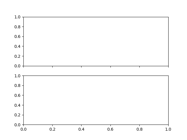
A figure can (and often does) have multiple axes. This is a great way to plot multiple graphs side by side - each axes corresponds to a single graph.
By default, axes are laid out in a rectangular grid; similar to NumPy, you can pass the dimensions to subplots:
from matplotlib import pyplot
figure, (top_axes,bottom_axes) = pyplot.subplots(2)

figure, (left_axes, right_axes) = pyplot.subplots(1,2)
figure, ((top_left_axes, top_right_axes),
         (bottom_left_axes, bottom_right_axes)) = pyplot.subplots(2,2)
Axes can share some axis data and ticks; you can pass subplots the sharex=True or sharey=True options for common axes:
figure, (top_axes,bottom_axes) = pyplot.subplots(2,sharex=True)
Non-Uniform Layouts
You may find that a basic grid of graphs, all the same size, is not for you.
For that, you have GridSpec, a complex specification system for constructing plots which span multiple grid lines.
For example:
from matplotlib import pyplot,gridspec

figure = pyplot.figure(tight_layout=True)
gs = gridspec.GridSpec(2, 2)
axes1 = figure.add_subplot(gs[0, :])
axes2 = figure.add_subplot(gs[1, 0])
axes3 = figure.add_subplot(gs[1, 1])
You can also inset plots with the axes.inset_axes command with a list (as percents of the parent figure) [lower_left,lower_right,width,height]:
from matplotlib import pyplot
figure,axes = pyplot.subplots()
inner_axes = axes.inset_axes([.75,.5,.2,.3])
Plotting
Now we have our axes, how do we plot on it?
At its core, matplotlib just plots a bunch of lines. This is easy enough to do yourself - in fact, for most of my personal plotting needs I do just that - but it can quickly and efficiently plot a line itself.
Try and guess what the following will do:
from matplotlib import pyplot
figure, axes = pyplot.subplots()
axes.plot([1,2],[3,4])
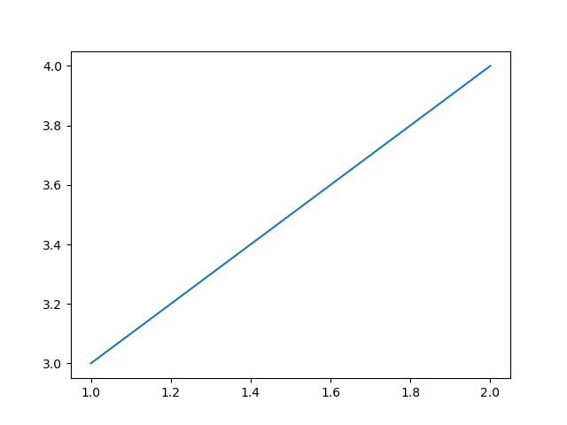
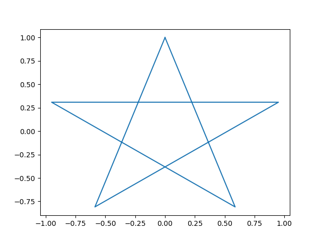
MatPlotLib does not care about the axis order: it plots the points, as $x,y$ pairs, connected in the order you provide:
from matplotlib import pyplot
from math import sin,cos,pi
figure, axes = pyplot.subplots()
axes.plot([sin(2*i*(2*pi/5)) for i in range(6)],
          [cos(2*i*(2*pi/5)) for i in range(6)])
Plotting Functions
MatPlotLib, in fact, cannot handle anything other than printing and connecting coordinates.
This is not a problem from numpy - in general, numpy data is discrete and tabular. However, if you are trying to plot functions from outside of numpy, you will have to turn them into coordinates.
As an example, let's plot sin(x) from the math library.
from matplotlib import pyplot
from math import sin
figure, axes = pyplot.subplots()
x_values = range(10)
y_values = [sin(x) for x in x_values]
axes.plot(x_values, y_values)
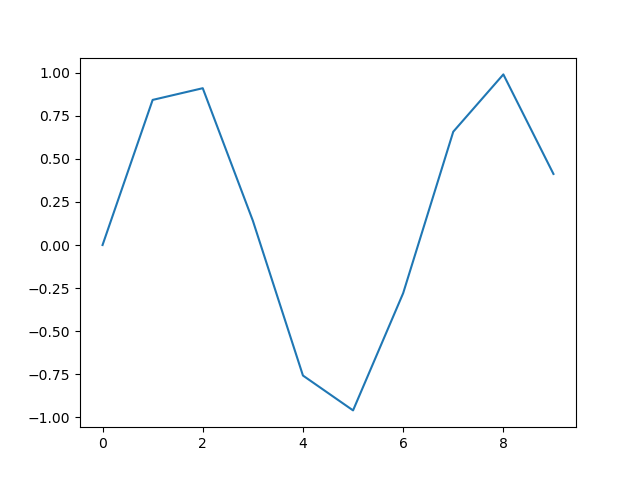
This is very jagged. To get a better idea of what is going wrong, let's show the points and grid:
from matplotlib import pyplot
from math import sin
figure, axes = pyplot.subplots()
x_values = range(10)
y_values = [sin(x) for x in x_values]
axes.grid()
axes.plot(x_values, y_values,marker='*')
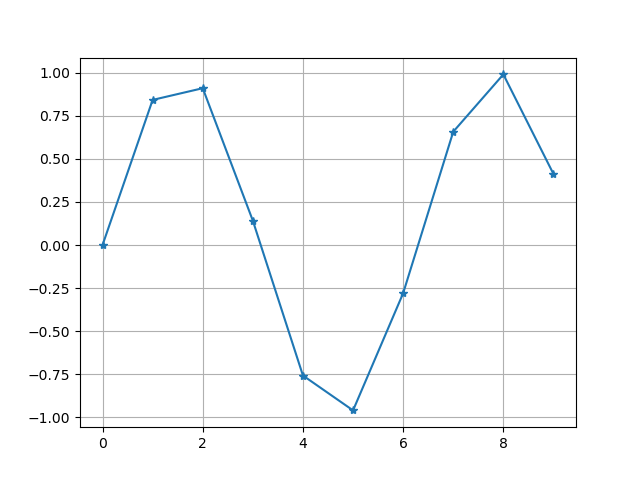
There are several marker styles; a reasonably complete list is available in the documentation.
This is just putting points at every integer! That's too few. We can smooth the jagged portions by using more points. Python ranges are just integers, and we could mess about with dividing them, but we can get more readable results faster with numpy arrays.
For plotting, there is a new array constructor we can use: numpy.linspace. It produces closed intervals, with a set number of subdivisions; for example,
print(numpy.linspace(0,1,5))
# [0.   0.25 0.5  0.75 1.  ]
This lets us:
from matplotlib import pyplot
from math import sin
import numpy
figure, axes = pyplot.subplots()
x_values = numpy.linspace(0,10,100) # 100 subdivisions
y_values = [sin(x) for x in x_values]
axes.plot(x_values, y_values)
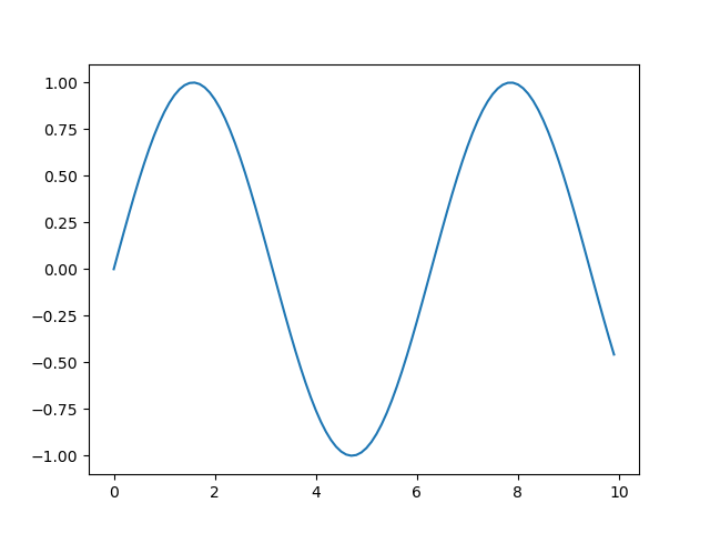
Much better.
Note that for a lot of common math functions, numpy has an array version: numpy.sin(x_values) is a slightly faster way to compute this example. However, for a lot of functions you may come up with, you will have to parse them entrywise.
Plotting Coordinate Pairs
Let's say that you had a list of pairs. matplotlib only takes lists of x and y coordinates.
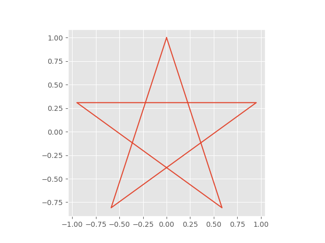
Let's use the star from earlier, rewritten:
from math import sin,cos,pi
pairs = [(sin(2*i*(2*pi/5)),cos(2*i*(2*pi/5))) for i in range(6)]
Fortunately, we can do some fancy python using two core features: Argument Unpacking and zip.
zip is something you should definitely have in your toolbox. It takes any number of lists and creates a iterator of tuples of elements of those lists.
For example:
list(zip(range(5),range(2,10,2)))
#[(0, 2), (1, 4), (2, 6), (3, 8)]
Argument unpacking takes a list and turns it into arguments.
zip takes each array as an argument; we want to zip together all our arrays, so addressing them one by one is out of the question. So we can unpack our arugments using a single *:
x_values, y_values = zip(*pairs)
We can even use the unpacking argument to get the $x$ values and $y$ values out of zip:
from matplotlib import pyplot
from math import sin,cos,pi
pairs = [(sin(2*i*(2*pi/5)),cos(2*i*(2*pi/5))) for i in range(6)]
figure, axes = pyplot.subplots()
axes.plot(*zip(*pairs))

Making it Pretty
You could, if you wanted, spend your whole life customizing your pyplots. If there are a few little things you want to change, then dive into the documentation!
However, if you are more precise in your desires, then you should just draw your own plots in svg. MatPlotLib will do as MatPlotLib does.
That said, its defaults are not particularly good; fortunately it is easy to get past that.
Stylesheets
The first thing you can do to improve things is to use a Style. Just like in HTML, and in $\LaTeX$, MatPlotLib supports styles. You can get a full list of the available styles with pyplot.style.available.
Note that styles are managed in a global sense; we have managed to avoid globals somewhat (using the new syntax), but this is one area where it is somewhat more difficult (and left as bonus content).
from matplotlib import pyplot
from math import sin,cos,pi

pairs = [(sin(2*i*(2*pi/5)),cos(2*i*(2*pi/5))) for i in range(6)]
figure, axes = pyplot.subplots()

pyplot.style.use('ggplot') # SETS STYLE FOR ENTIRE DOCUMENT
axes.set_aspect(1)
axes.plot(*zip(*pairs))
You can define your own stylesheet, and defaults for your computer, but that is outside the domain of this course.
Using Styles Without State-Changes with a Context Manager
Stylesheets can be loaded and unloaded with context managers.
with pyplot.style.context("stylesheet.mplstyle"):
    pass # Your style use here
However, this requires some knowledge about what .mplstyle file you are looking for.
You can use stylesheets to set just about every configuration parameter of MatPlotLib, but in general they focus on display.
You can return the default parameters with the command:
pyplot.rcParams.update(pyplot.rcParamsDefault)
Options for Your Axes/Plots
Some choices are more moment-to-moment, graph-to-graph, and not suited for global styles. For that, you can call customization functions on the axes or pass style information to the plot function - depending on whether you are styling the axes or line.
Styling Axes
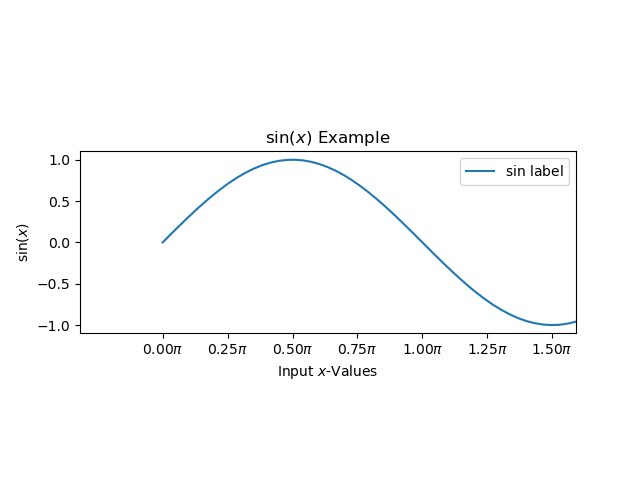
For your axes, most customizations are set as methods after creation. This documentation is fairly complete on the options. This is also where you label your axes. Some choice examples:
from matplotlib import pyplot
import numpy

pyplot.style.use('ggplot')

figure,axes = pyplot.subplots()
axes.set_aspect(1)
axes.set_xlabel("Input $x$-Values")
axes.set_ylabel("$\sin(x)$")
axes.set_title("$\sin(x)$ Example")
axes.set_xticks(numpy.arange(0,10,numpy.pi/4))
axes.set_xticklabels("{:.2f}$\pi$".format(i)
                     for i in numpy.arange(0,10/numpy.pi,1/4))
axes.set_xlim(left=-1,right=5)

x_values = numpy.linspace(0,10,100)
axes.plot(x_values,numpy.sin(x_values),label="$\sin$ label")

axes.legend()
Styling Lines
Line Styling, by contrast, is mostly done at creation with style strings. These options are documented in the plot function.. Here's an example from earlier:
from matplotlib import pyplot
from math import sin,cos,pi
pairs = [(sin(2*i*(2*pi/5)),cos(2*i*(2*pi/5))) for i in range(6)]
figure, axes = pyplot.subplots()
axes.set_aspect(1)
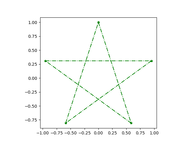
axes.plot(*zip(*pairs),color="green", linestyle="-.",marker="*")
Festive!
Saving Plots
Now that we can create plots inline, we can save them with figure.savefig:
from matplotlib import pyplot
from math import sin,cos,pi
pairs = [(sin(2*i*(2*pi/5)),cos(2*i*(2*pi/5))) for i in range(6)]
figure, axes = pyplot.subplots()
axes.set_aspect(1)
axes.plot(*zip(*pairs),color="green", linestyle="-.",marker="*")
figure.savefig("finalstar.png")
You may find that this saves with extra whitespace. You can often get rid of it with some savefig parameters:
figure.savefig("finalstar.png",bbox_inches = 'tight', pad_inches = 0)
Worksheet
Today's worksheet takes you through creating plots programmatically!